Brand Identity for Rickshaw Stop
In 2005 I designed an identity for this hip music venue in San Francisco’s Hayes Valley district. The owner did not want anything slick; the aesthetic was punk, DIY and laid back. The kind of place you can walk in, buy a cheap beer and a grilled cheese sandwich and watch a band for five bucks. The floor was concrete and there wasn’t even a sign out front because they didn’t want one.
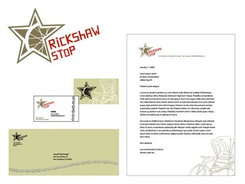
The project consisted of developing a logo using a couple of the icons that seemed to permeate the space- an old rickshaw. brought back from Vietnam by the owner and a star embedded in the sidewalk in front that sort of indicated where the club was.
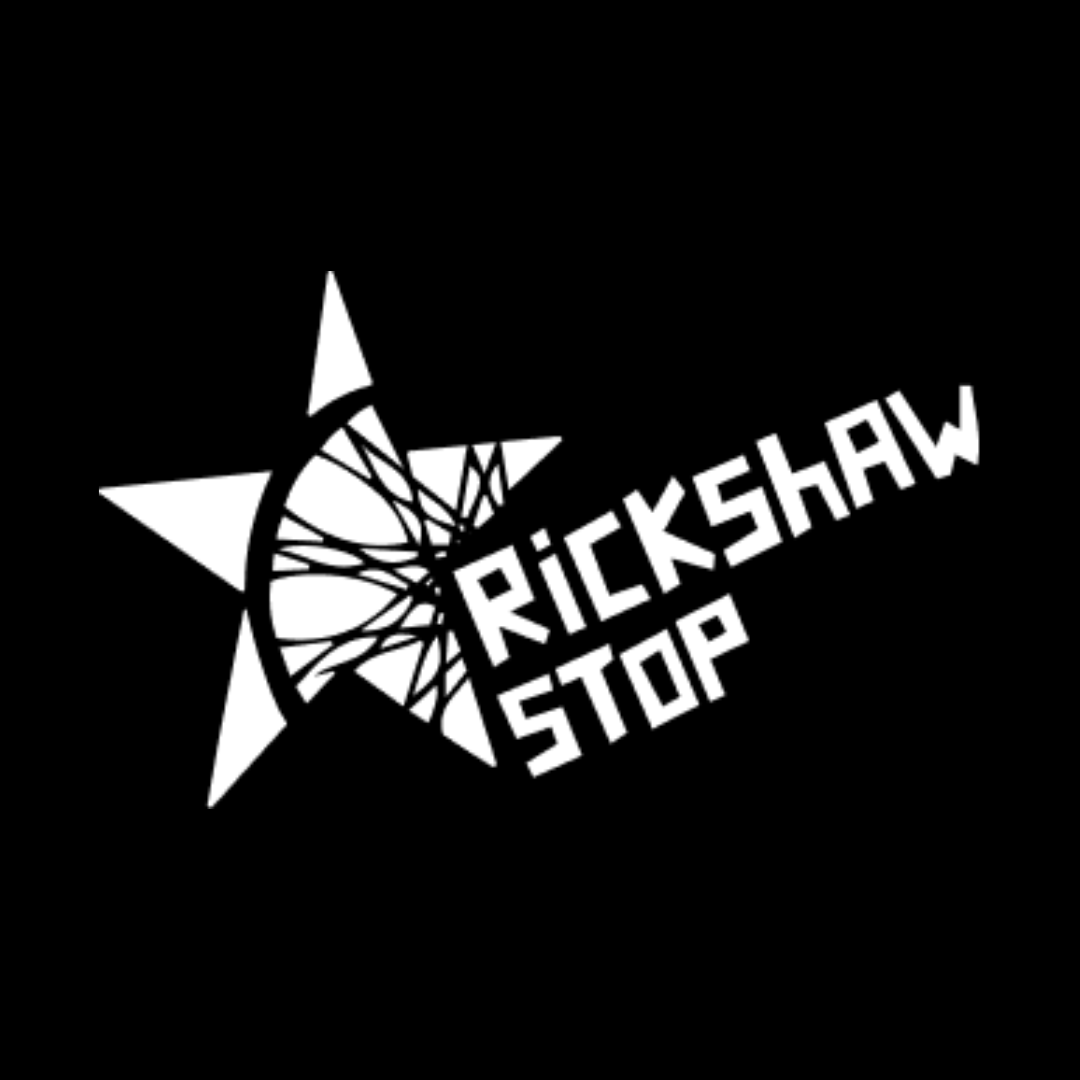
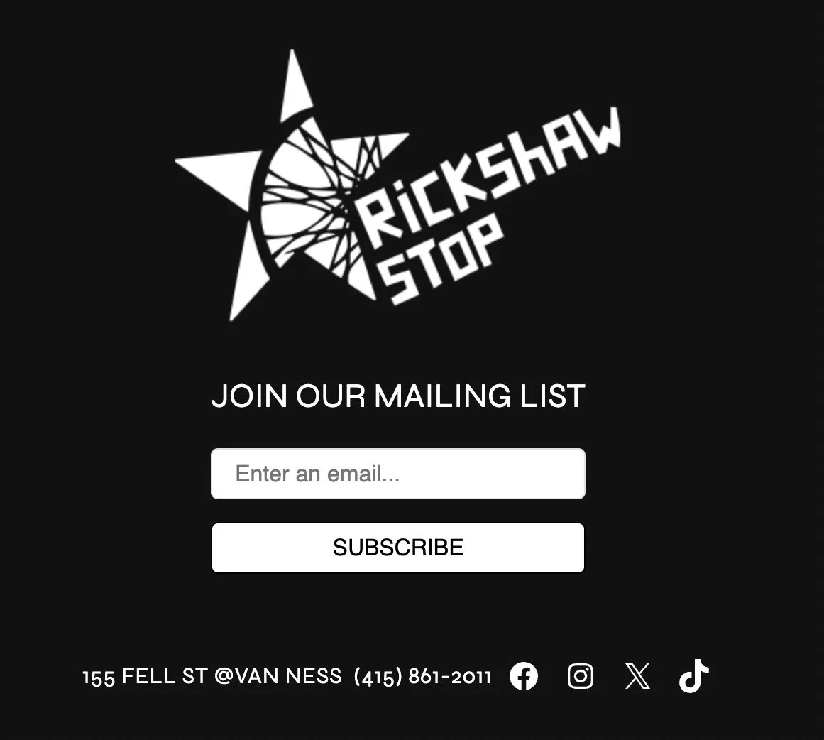
The final logo is an imperfect, five-pointed star, containing a bicycle wheel which is how these rickshaws are powered. The typeface chosen is a cut-out style that brings the DIY aesthetic to the brand. I designed a set of letterhead, envelopes and business cards as part of the job.
Any time I suggested something like the logo to be printed on napkins he would bristle and say something like “yeah that’s what I mean- we don’t want anything like that.” So they ended up just using the logo- which they are still using so I must’ve done something right!
Rickshawstop.com