Brand Identity for
Mockingbird Improv
In 2021 a new improv theater was launched in San Diego and part of this involved a branding session which I led and included several exercises in which the co-founders nailed down the company’s values, it’s market position and differentiation. The four top values were Fun, High Quality, Respect for Craft and Welcoming Vibe.
Next came an intensive naming project that involved many people and even a naming professional that offered 100 possible names. In the end, the founder decided to go with the name that was in her heart: Mockingbird.
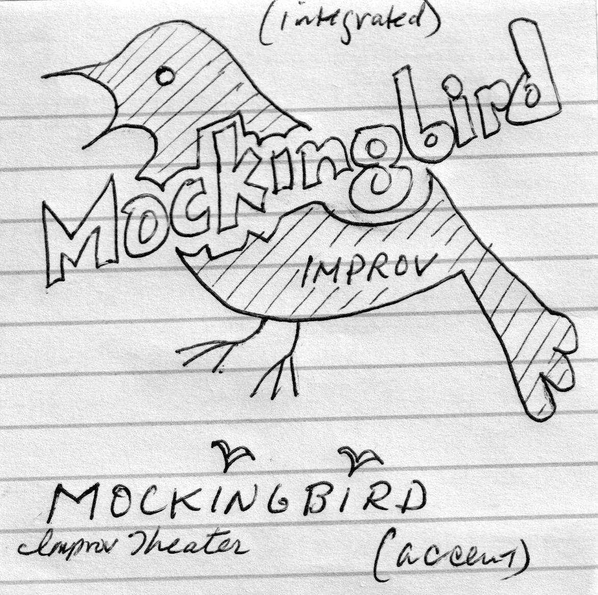
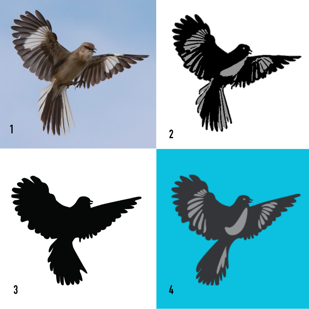
When it came time to design the logo, another designer was hired to do the text logotype. Only he wasn’t able to create what was needed in terms of an image, which would be either a bird or a wing. It also had to be noticeably a mockingbird.
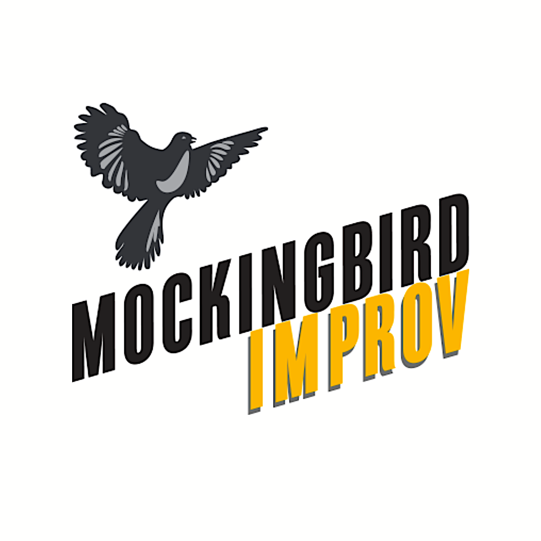
After hundreds of sketches of feathers, wings and stylized mockingbirds I took a photograph of a mockingbird, drew it out as a cartoon, including the unmistakable wing markings. A little smiling eye was the finishing touch. We combined it with the logotype and the logo was born. Then I had to add drop shadows to the golden-colored word “improv” so it would stand out against all backgrounds. Finally, I had to reposition the elements so it would fit in a circle when that was needed for social media.
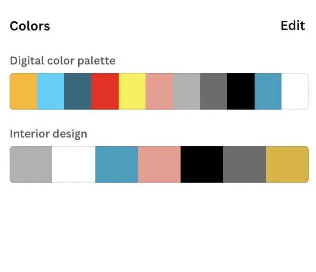
The color pallet was chosen to be fun, bright, and optimistic, while also conveying quality, and strength. The happy aqua blue and contrasting gold are the two main hues. Secondary were a red and charcoal gray for deeper feeling and an accent color of salmon added the luxury note.
Typography was based off the logotype font- DIN Condensed Bold, designed by Charles Nix. This is modern and clean and used to anchor and ground any light, fun humorous imagery.
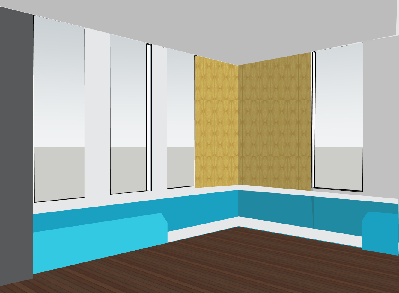
The interior design of the space echoes the color scheme and the fun vibrancy with a touch of luxury that welcomes patrons and performers, alike.